Iowa caucuses - who really lost to who?
Published:
I happened to be watching a press conference from the Iowa Democratic Party when they released their first caucus results and was interested in seeing what - if anything - could be gleaned from the decision to list more extensive data. While most of the main results have been discussed in more depth elsewhere, I was curious if I could get an indication of how delegates shifted from the first to second rounds. What follows is a first quick attempt to see if any patterns can be found in the data, with hopefully a more extensive analysis to follow when full results are released and I have some time to do some modelling.

Highlights
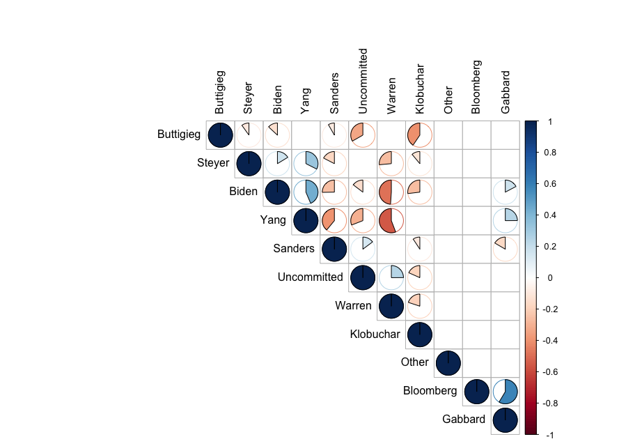
A quick look at the correlations between the change in delegates selecting a given candidate from the first to second round shows some significant correlations, as seen in the correlation matrix above. It shows some interesting negative relationships, mainly between Warren, Biden and Yang, with weaker negative relationships between Yang and Sanders, Buttigieg and Klobuchar, Biden and Klobuchar, and Biden and Sanders. This gives a first indication that at a precinct level, votes from the delegates from the first round may have been more likely to (in the second round) go to one of these candidates from the other.
Why is this interesting?
As the race heats up, and candidates drop out, results like this might help to indicate where the dropout’s supporters are most likely to shift. Sophisticated models usually estimate this based on demographics, ideological proximity of candidates etc., but this might provide an alternative way to get an idea as to who may gain from a candidate dropping out. This does not take into account candidates endorsing others who remain, but is an indication of where voters (without any outside influence) might find themselves gravitating.
Data and methods
After finding and importing the caucus data as provided by the Iowa Democratic Party from their website - I give an overview of how that might be done in another post - and getting the data into a long format, using a variable to indicate the candidate and rows for precinct data (thus each precinct has 14 rows, one for each candidate + undecided and other), I generated a simple variable to indicate the amount of votes gained or lost in the second round, and eliminated entries with zero values
caucus <- mutate(caucus, vGain = vote2 - vote1)
dfGainsNoZero[dfGainsNoZero == 0] <- NA
Then it’s a simple matter to calculate correlations and significance values between the candidates (after converting the dataset to a wide format, where each row is a precinct, and each column is a candidate’s vote shift)
# find pearson correlations and p values (selecting only variables which are
# numeric in the data frame)
rcorMatrix <- rcorr(as.matrix(dfGainsNoZero[sapply(dfGainsNoZero, is.numeric)]),
                    type = "pearson")

# Graph correlations w/ only significant values (95%) shown as pies
rcorPlot <- corrplot(rcorMatrix$r, type="upper", order="hclust", addrect = 3,
         p.mat = rcorMatrix$P, sig.level = 0.05, insig = "blank",
         method = "pie", tl.col = "black")
The corrplot package provides a nice easy way to visualize the resulting correlation matrix, and the result is seen in the figure at the top of the page.
Caveats
This is a very simple, very vague indication of where delegates might have moved from and to between rounds of voting. This only reflects the net change in delegate count, and does not reflect that candidates may have gained some delegates and lost others, or traded amongst the other candidates. This data also reflects only an initial sample of 62% of all precincts; now that unofficial data is available for all precincts, I will re-run and continue the analysis.
I would like to build on this with a more sophisticated approach, but that will take more time and this is something of a side project for me. I am by no means an expert in political science or analysis of voting or elections.
